Hover/click-driven CSS Flip Card Animation
CSS Flip Animation: Super SMOOTH 3d Flipping Cards

Struggling to work with flip animations in CSS?
Don’t worry. CSS flip animation effects were never this easy and attractive before in the front-end development world.
I mean, doing 3d card flip animation effects with plain and simple CSS and no JavaScript at all is amazing, isn’t it?
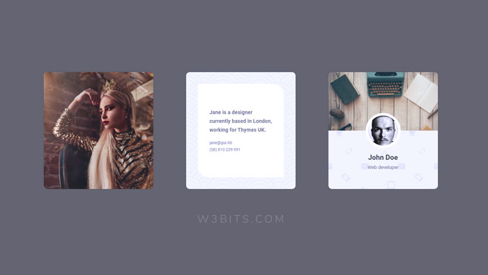
Flip animations are around for a while now, and you must have seen them somewhere in action already. Some of its best use cases can be user cards, offers, testimonials, and product covers.
This post is all about creating a cool 3d flipping animation effect with nothing else but CSS (and HTML of course). It’s actually from an archived project of mine and it looks like something like this.
This one right here is a polished, finished component though, with some improvements and enhancements.
Both the vertical and horizontal flip animation effects follow the same principal. I’m going to cover the horizontal one here.
The rest of this post is a break-down of this horizontal flip animation effect into a small bunch of easy steps.
- The Concept
- Basic CSS flip animation
- Advanced 3d flip animation
- Responsive CSS card flip
- Card flip on click event
The Concept
Thinking of something fancy; like simple, static flipping of an image for example wouldn’t take much. One CSS property, and you are good to go.
img,
.flipped-box {
  transform: scale(-1);
}
And there you have your image or box flipped, see it in action here. Let’s talk something more practical and functional.
What about a card?
Cards have a lot to do with Web design nowadays. The concept is as simple as a real life card, let’s start building it with some basic CSS and HTML.
<div class="card">
  <p>Card's contents.</p>
</div><!-- .card -->
Let’s give our card its much needed dimensions. I’m keeping the height little bit greater than the width to give it a card-like size.
.card {
  width: 300px;
  height: 320px;
}
But a card has two sides to it.
Our CSS flip card is also going to have two sides. And since our card would change its position on a “hover” event, it would be good not to move the card element but it’s contents.
This will also keep our flip card from being jerky or choppy in movement when “hovering” over it.
To keep things simple and organized, let’s wrap both the front and back sides of our card in a separate box. This box division is the inside of our main card element, which moves when an event is performed on its parent.
Based on the above logic, let’s now modify or extend the HTML for our flipping card element.
<div class="card">
<div class="card__inner">
<div class="card__front">
<p>Card's front</p>
</div><!-- .card__back -->
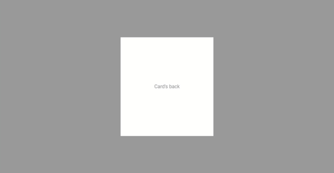
<div class="card__back">
<p>Card's back</p>
</div><!-- .card__back -->
</div><!-- .card__inner -->
</div><!-- .card -->Looks sophisiticated I guess. Similarly, the CSS can also be extended to bring the card’s inside and its front and back sides into the scene.
.card,
.card__inner {
 width: 300px;
 height: 320px;
}

.card__front,
.card__back  {
  display: flex;

  color: #888;
  background-color: #fff;

  justify-content: center;
  align-items: center;
}
The flexbox properties for both the sides of the card are for hassle-free alignment of the content. Up next is the real application of the above structure with the help of some CSS magic.
Basic CSS flip animation
Or in other words, call it the wireframe of our 3d flip animation. Now, go back and notice that static and fancy flipped image CSS again.
The same can also be used in the card animation, but I’ll avoid that. If you ask me why, it’s because the scale transformation trickery won’t be of any help to reach our goal of 3d animation.
Therefore, to keep things in 3d, we’ll be using the CSS rotation transformation instead.
.card {
  &:hover,
  &:active,
  &:focus {
    .card__inner {
      transform: rotateY(180deg);
    }
  }
}

.card,
.card__inner {
  width: 300px;
  height: 320px;
}

.card__inner {
  transition: transform .25s ease-in-out;
}

.card__front,
.card__back  {
  display: flex;

  color: #888;
  background-color: #fff;

  justify-content: center;
  align-items: center;
}
But all this is not enough until we achieve a proper setup for both sides of our card. By proper setup, I mean…
- Overlapping of both the sides; the front should stack on top of the back
- Rotation of the back on its vertical axis; for the correct display of its contents on animation
- Shifting the transformation origin to the center; or it would look more like a flip-book
.card {
 &:hover {
   .card__inner {
     transform: rotateY(180deg);
   }
 }
}

.card,
.card__inner {
  position: relative;

  width: 300px;
  height: 320px;
}

.card__inner {
  transition: transform .25s ease-in-out;
}

.card__front,
.card__back  {
  position: absolute;
  top: 0;
  left: 0;

  display: flex;

  width: 100%;
  height: 100%;

  color: #888;
  background-color: #fff;

  justify-content: center;
  align-items: center;
}
Okay, now it looks more like a card.
It does flip over on hover event, but its sides on animation are still messed up. It also lacks that 3d effect that we are trying to achieve.
What do we need here then?
Stacking the sides differently on hover event? I don’t think it’s required with the CSS3 3d transformation properties.
With the transform-style property, we can tell the browser to place it in a 3d space. And above all, we can play with the CSS perspective property to find the perfect perspective for our card.
.card {
  perspective: 1000px;
  &:hover,
  &:active,
  &:focus {
    .card__inner {
      transform: rotateY(180deg);
    }
  }
}

.card,
.card__inner {
  position: relative;

  width: 300px;
  height: 320px;
}

.card__inner {
  transition: transform .25s ease-in-out;

  transform-origin: 50% 50%;
  transform-style: preserve-3d;
}

.card__back {
  transform: rotateY(180deg);
}

.card__front,
.card__back {
  position: absolute;
  top: 0;
  left: 0;

  display: flex;

  width: 100%;
  height: 100%;

  color: #888;
  background-color: #fff;

  justify-content: center;
  align-items: center;
  backface-visibility: hidden;
}
I’ve set the backface of each side hidden in order to keep the display proper during the animation. No glitches anymore!
See the basic flip card in action
Advanced 3d flip animation
Since we have the basic idea of pure CSS-based 3d flip card, we can now decorate it by adding personalized styles.
Extending the basic card animation, I created some advanced and decorated mock-ups. I tried making them look like v-cards and user cards, as that’s where the flip-cards are used the most.
I’m not sharing all that fancy CSS here, but I do have a showcase of the same and will keep on adding more to it in future too.
Responsive CSS card flip
Now, some of you might wonder why I added a fixed size to the card. True, fixing the size is not at all mobile-friendly.
I’ve used a small size (i.e. 300px) for the card in the examples above which I think shouldn’t hurt much on small screens.
Here is a workaround to make them behave responsibly in case you are planning to do bigger sizes for your cards.
.card,
.card__inner {
  width: 300px;
  height: 320px;
  max-width: 100%;
}
It’s completely responsive to the screen width now.
Card flip on click event
Now, this would require a little bit of JavaScript.
Why not with CSS? Well, it can be done with CSS too, but that would make it very sloppy in terms of accessibility and semantics.
Let’s tweak our CSS a bit by adding a flipped-over state for our card before we jump into the JavaScript part.
.card {
  perspective: 1000px;
  &.card--flipped {
    .card__inner {
      transform: rotateY(180deg);
     }
  }
}
Did you notice that we ommitted the hover state from our CSS? It’s obvious, it’s not needed anymore.
We can now toggle the flipped-over CSS class whenever our card element receives a click event.
// Get all the `.card` elements
let cards = document.getElementsByClassName('card');

// Loop through all the card elements
cards.forEach((card) => {

   // Track the clicks on the card element
   card.addEventListener('click', () => {

    // Toggle the `flippedstate` CSS class
    card.classList.toggle('card--flipped');
    console.log("Card clicked!");
  });
});
See a working demo here.
And that sums everything up.
It was much easier than it seemed to be. What do you think?
Now comes your turn to fork and play with the code and come up with something that you wanted to make. I invite you to share in the comments what you made with this tutorial. And also your priceless thoughts, of course.
Load Comments...