Understanding the CSS Box Model
I didn’t learn CSS systematically. First I started playing with colors and fonts, then I started building (those insane, red-green) ‘table-based’ layouts. And then suddenly I came across the CSS box model. On the same day I truly started learning web design.
The model helped me understanding the relationship between margin, padding, border, the width and the height of the elements.
Understanding the box model in CSS is a foundation step in one’s learning to CSS and web design properly – because it helps you to know the sizing of layouts more closely and effectively – which is the key phase of web design. How? We’re going to know in this article further. So, without much a do, lets get started.
The basics of CSS Box Model
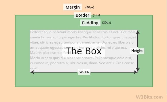
Every markup element is a rectangular box, that we can enhance and style using CSS. Concentrate on the below figure that demonstrates a markup element as a box:

In the above figure, our markup element – let us say it box – 150 pixels wide, carries padding and margin of 20 pixels on each side, with a border of width 1 pixel each side. I have done some highlighting in the figure to demonstrate where a particular thing lies.
The first most or the orange part of the figure is the margin of our box, the dark green colored line is it’s border, and the innermost, green colored part is the padding. Let me explain these three terms one-by-one hierarchically.
- Margin: It lies outside the box and is basically used to separate itself from other markup elements.
- Border: It is the border of our box, that also lies outside but before margin.
- Padding: Lies inside of the box, creates inner space in the box when used. It lies after the border.
I think I don’t need to explain the width and height attributes, as these are very common terms .
Calculating net height & width of the box
Margin, border and padding – altogether make the overall width and height of our box. So, as of the Box model, the net width of the box would rely on the below expression:
Width + Left margin + Right margin + Left border + Right border + Right padding + Left padding
Based on the above formula, the total width of our box is:
150 + 20 + 20 + 20 + 20 + 1 + 1 = 232 pixelsSimilarly, the height of the box can be calculated using this way:
Height + Top margin + Bottom margin + Top border + Bottom border + Top padding + Bottom padding
Which gives (we didn’t apply any height to our box):
0 + 20 + 20 + 20 + 20 + 1 + 1 = 82 pixelsSo, basic addition can give us the overall height and width for markup elements, and this way we can plan the workaround for the other elements of our layout, for example: by knowing the net width of content area, we can decide or adjust width for the sidebar.
The box model approach applies to every element regardless of it carries an inline or block display.
Box model in Firebug / Inspect Element
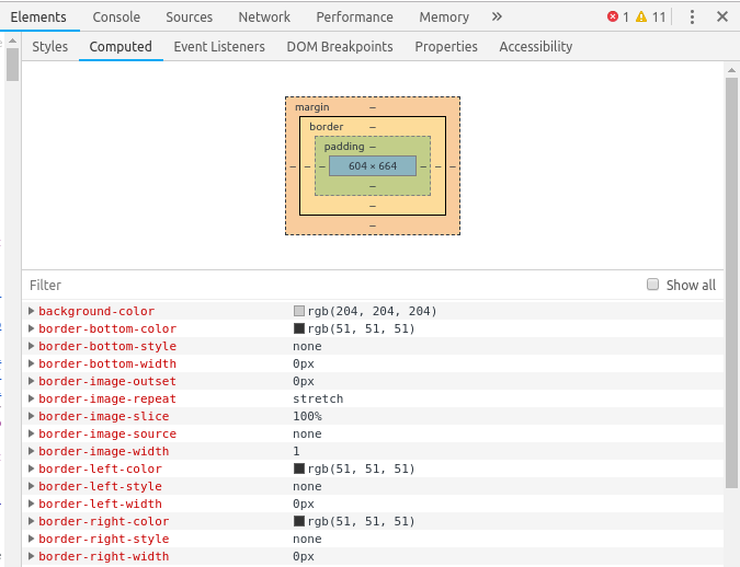
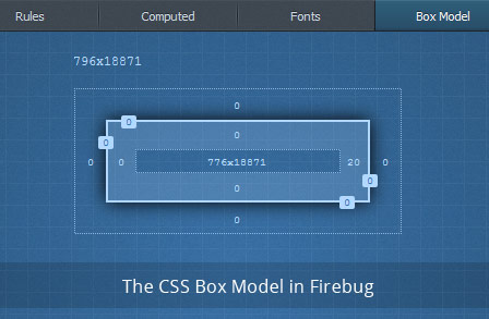
Using the developer tools in your web browser, you can quickly view the box model for your layout’s elements. Press Ctrl/Cmd+Shift+i to quickly bring up the developer options.
Chrome Developer Tools

Firefox’s Inspect Element

Playing with boxes
If you want to see the box model approach in action right in your browser, just apply colored outlines to all of the elements (or the most important i.e. the building blocks) in your markup. Below give tiny CSS snippet will help you to highlight every ‘box’ of your web layout.
* {
outline: 1px solid #ff0000;
}
Conclusion
That pretty much wraps it up. I hope this article has explained you the model well. Kindly share your thoughts on this topic using the comments section below.