CSS Sprite Animation Tutorial
Quick n’ Easy Spritesheet Animation with CSS
Ever thought of creating a CSS sprite animation without using JS at all?
We all have seen traditional animation in action since our childhood. Whether it was some animated movie or a 2d video game, traditional animation was an integral part of it.
In this type of animation, a sequence of separate frames is played to create the animation.
Similar form of animation has been used in the gaming industry as well and for a long time. The gaming folks call it classic or spritesheet animation.
This technique involves playing a sprite containing several states of a particular sequence.
Intriguing, isn’t it?
In this post, I’m gonna share with you how you can create spritesheet animations in CSS. You may see a demo first if you want.
Basic idea of CSS Sprite Animation
In general, we need three important things to implement the sprite animation:
- Animation viewport to display our sequence
- A sprite containing the different states of the sequence
- The technology to play the sprite as animation
What I’m gonna use?
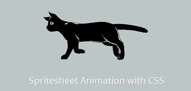
I’m using an HTML division element (<div>) to create the viewport for our animation sequence. For the sprite, I’ve used this cat sprite that I got from the Internet.
Lastly, I’ll make use of CSS keyframes as the technology to play my sequence. In case you are beginning up with CSS, don’t forget to go through CSS sprite tutorial.
HTML
The markup is pretty simple–just one single div representing our animation viewport.
<div id="cat"></div>The Simple Math
Before going any further, get to know the following things about your sprite image:
- How many steps (states or stages) it carries. We have 12 in this example.
- What’s the width and height of each state in it. We have
399x200pxfor each state here. - Is the sprite horizontal or vertical. Ours is vertical.
Determining the steps, dimensions, and nature of the spritesheet
Simply count the different states your sprite image carries. Be aware of the height and width of each step, as it will decide the size of our viewport.
Also make sure that the dimensions of each state of the sprite should be equal to avoid jerks in the animation. This is important because the sequence shouldn’t get disturbed when the animation plays.
If the states in your sprite align one besides the other, it’s horizontal. If they align one below the other, it’s vertical. Try to avoid the hybrid sprites (vertical + horizontal), as they complicate things.
CSS
After knowing the nature of our sprite, here are some styles for the viewport and animation.
#cat {
  width: 399px;   /* Viewport-width */
  height: 200px;   /* Viewport-height */
  margin: 2em auto;   /* Little margin */
  background: transparent url('/path/to/sprite.png') 0 0 no-repeat;   /* Our sprite as the viewport background */
  animation: catwalk 1s steps(12) infinite; /* The Animation */
}

/* Animation keyframes for the sprite */
@keyframes catwalk {
  100% { background-position: 0 -2393px; }
}
The first thing to note in the above CSS is that I’ve used our sprite image as the background image of our viewport. The catwalk animation moves the sprite in 12 steps till the y-position reaches end. (End limits = -2393px).
Second thing to take note of is the steps() attribute used above. It plays our animation in equidistant steps according to the height/width of the states.
That’s it. Check out the demonstration.
Live Demo of CSS Sprite Animation
Notes
- If you’re using a horizontal sprite, you should animate it horizontally. For eg., if I had used a horizontal sprite here, I would have declared the keyframe animation like this:
@keyframes catwalk { 100% { background-position: -2393px 0; } } - If our sprite is vertical, the
step()considers state’s height to play the animation. If it is horizontal,step()focuses on the width of the state.
That’s all folks. Do let me know your thoughts on this. Cheers!