Pixel Polyfill for REM Units (with SASS Mixin)
It is so common to see rem units over em and px nowadays in web design, which has been around since 2012.
The rem unit is expanded as “Root em”. In case you don’t know how to use it, you should read this awesome article by Jonathan Snook.
Unlike em, rem gives you the freedom to size things without depending on the font-size of the parent element.
I’m not advocating rem here—in fact I’m using em in all my projects as yet, but still there are people who want things simplified with less calculations, which can only be possible with rem.
Why not em or px?
If you know the difference between px, em, and rem, you already know the answer to this why.
Note: The major concerns in today’s web design is the accessibility and compatibility. These two things has made industry people think more than ever on what to choose and what not.

- Pixel or
pxunit allows you to size things independently without relying on the font-size of the parent element. If you go with thepx, that will make things go rigid and unresponsive across different screen resolutions. - Whereas
emis relative to the current font-size of the browser window. If you go with theem, you make that responsiveness task more easier. But you have to do more math as the sizing withemcompletely depends on the font-size of the parent. - Whereas
remonly depends on the font-size of the root element, and not of the parent. This cuts that extra work of keeping in mind the font-size of the parent.
As rem is a CSS3 addition, you don’t have it supported on all web browsers especially the older ones. So, using a fallback is certain to make things look good where it lacks the support.
Pixel Polyfill for rem
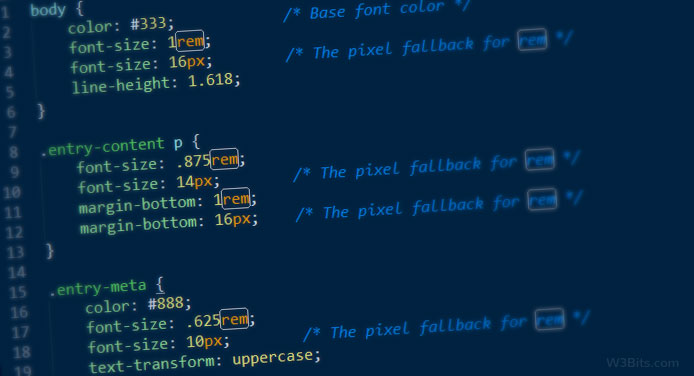
You may use a simple pixel fallback for rem units. Take a look at below given block of CSS:
.entry-content {
  font-size: 16px; /* px declaration */
  font-size: 1rem; /* rem declaration */
}
The hack is very simple. We have to declare the size property (font-size, width, height) in px first, and then re-declare the same properties with equivalent rem units.
Browsers that lack rem support will read only the size in pixels, and will ignore the rem declaration.
rem and equivalent px
How would you calculate the equivalent rem font-size in pixels? Here’s the explanation:
If your root element (<body> or <html>) uses a font-size of 100%, your base font-size in pixels is 16. Therefore, giving a property a value of 1rem, you would declare it of 16 pixels.
Similarly, to declare a value of 10px, 0.625rem (=10/16) have to be given to the property.
Further, you may set the font-size of root element as 62.5% that will make the base font-size of 10px; i.e. 1rem = 10px ‐ that would makes things pretty easy on the calculation side.
html {
  font-size: 62.5%; /* 16*(62.5/100) = 10 =&nsp; 10px = 1rem */
}

.entry-content {
  font-size: 10px; /* px declaration */
  font-size: 1rem; /* rem declaration */
}
SASS mixin
If you make extensive use of rem units in your projects, then having a SASS mixin for px fallback for rem is a must.
/**
 * $size: Font-size to be converted from `px` to `rem`
 * $base: Base font-size (Change its value as per your need)
 * @return void
 */
@mixin font-size($size, $base: 16) {
  font-size: $size; // fallback for old browsers
  font-size: ($size / $base) * 1rem;
}
Usage
Whenever you feel the need to declare our flexible font-size in rem and px, follow like this:
.entry-content {
@include font-size(12);
}
Easy!
That’s pretty much it. Hope you found this useful, thanks.