A Guide to Absolute Centering in CSS
Centering things in CSS has always been quite a task for the front-end developers.
And how about centering both horizontally and vertically within a parent element? It’s a pain when you don’t know how to do that correctly.
Centering something or a group of things vertically and horizontally is usually called as absolute centering in CSS. This article covers some nice ways to achieve that with some implementation examples.
Let me give you some use cases first, where we generally feel the need of CSS absolute centering:
- Icons in CTA Buttons
- Prompt or alert boxes
- Structural elements (eg. layout grid, grid cells)
- Navigation components, eg. list items
- Spinners and loaders
If you are doing all the above mentioned thing the inline-block or table way, you are doing it wrong. Let’s now jump into the centering techniques without any delay.
Flexbox!
No explanation is needed, when it comes to aligning things with CSS flexbox properties. With the CSS flexbox module, you have a great control over aligning elements and not just the centering, but you can do a lot more things with properties like justify-content, align-items, align-content, and align-self.
First off, you need to apply display: flex to the wrapping division (or parent) as shown below:
.box {
  display: flex;
}
And here are the code snippets for basic centered alignments along with the demonstration links:
Horizontal Centering
By default, the flex-direction is set to row, and supplying the center value for justify-content will make the content inside the flexbox aligned centered horizontally.
.box {
  justify-content: center;
}Vertical Centering
For vertical-centering, the center value to align-items will align the flexbox content centered vertically.
.box {
  align-items: center;
}Absolute Centering
And as you might have guessed already, using the value center for both justify-content and align-items will make the flexbox content aligned at absolute center of the box.
.box {
  justify-content: center;
  align-items: center;
}Grid
Of course, for fallbacks, you may consider inline-block based middling wherever needed, but I have one more technique that seems much more handy than them.
Hacking the position
This technique is not required anymore, since you have flexbox working just perfectly for you. But! You always need a fallback to the modern CSS properties if your job required to make things compatible to older browsers as well!
The trickery lies in:
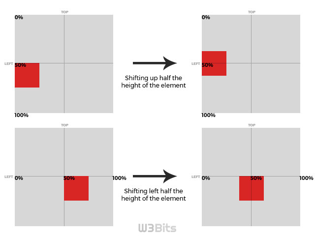
- Giving a top and/or left offset (50% of the total space available) to the absolutely positioned element. It’s the element which we want to appear aligned vertically/horizontally/absolutely centered.
- The element will now be starting from 50% horizontal and/or vertical coordinate(s) onwards of the total available space, which is of course, not the horizontal/vertical/absolute center of the parent division.
- In order to make it look centered, we can make some shift to the element to little on top and/or left side; that shift should be equal to half the width and/or height of the element. What comes to your mind to make these shifting with CSS? I think CSS transform property is all we need here.

A small pitfall of this technique is, you might need to provide a height at times when you need the parent element to be obvious enough.
Starting off with making our parent or wrapping element relatively positioned:
.box {
  position: relative;
}
Horizontal centering
Horizontal centering can be obtained by placing the object to 50% left inside the box, and then shifting it to left half of it’s total width.
.box .object {
  position: absolute;
  left: 50%;
  transform: translateX(-50%);
}Vertical centering
Vertical centering is achieved by giving a 50% to the top inside the box, and then shifting it up half of it’s total height.
.box .object {
  position: absolute;
  top: 50%;
  transform: translateY(-50%);
}Horizontal Centering
And obviously, placing at 50% from top and left inside the box, the object is required to be shifted left half of it’s total width and up half ot it’s total height.
.box .object {
  position: absolute;
  top: 50%;
  left: 50%;
  transform: translate(-50%, -50%);
}That’s it. You may however experiment using relatively positioned child elements too in the last technique I mentioned, but using absolute child inside a relatively positioned parent gives you more control as it doesn’t messes up with the flow anymore.
Let me know what you think about this. Thanks for your time :)