Center-align HTML Webpages with CSS
The Correct Way to Center-align Web Layouts
Surely you know about the web layouts aligned to the center of the browser window. Centering a website with CSS is not a big deal at all. In this tutorial, we are going to learn the correct way to center-align a web layout.
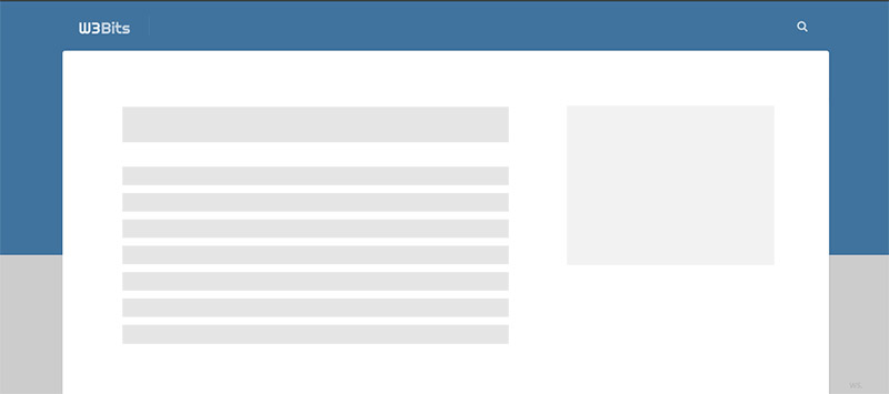
There are several thousand examples of centered layouts on web. One of such examples is this website only. I’m attaching a screenshot below to keep this contextual to the current centered layout I’m using right now.

Centering of layout is not limited to the fixed-width layouts only. They may greatly improve the usability in the hybrid full-width layouts too.
The Concept
When I started out as a web designer, I didn’t care much about the technique and flexibility of the design. I used to layout things strictly based on whatever I designed, and that was pretty much it.
Later on I developed a habit to see things closely, and how they are going to perform in the browser. I came to know some mistakes I was committing when I observed how my layouts look on different screens.
Center-aligning websites horizontally is one of those things which I was doing wrong. In short, listed below are some mistakes I made in that context and viewport responsiveness:
- Inflexible width of the layout or content wrapper
- Usage of text alignment CSS module to center align the layout
Flexible width of the wrapper
The first thing that comes to mind when centering the layout is setting the width. Now if you go by defining the width exclusively, you may have to do it for different breakpoints.
It’s always a better practice to define the inclusive or maximum width instead, for the wrapper. This keeps you from defining and overriding the exclusive width again-and-again.
Feel free to modify the highlighted values you are going to see in the code blocks below.
HTML
Assuming you are well aware of HTML and CSS, let’s start with the basic layout we are going to implement here.
<!DOCTYPE html>
<html lang="en">
<head>
  <meta charset="UTF-8">
  <meta name="viewport" content="width=device-width">
</head>
<body>
  <div class="content-wrapper">
    <!-- Everything else goes here. -->
  </div><!-- .content-wrapper -->
</body>
</html>
Note that the <html> and <body> by default acquire all the available rendering space in the browser window. In other words, they have their width and height attributes set to 100% already.
CSS
.content-wrapper {
  max-width: 960px;
}
Semantical alignment of the layout
Aligning the layout with the help of text-alignment properties doesn’t sound very semantically sane. Today we have magical CSS modules like Flexbox and Grid to streamline the alignment task.
In fact I have a separate guide for absolute centering with CSS.
But wait. How about the margin property in CSS?
If you’ve heard of and used CSS auto-margin, you know what I’m talking about. Couple it with some inclusively-sized element, and you have it aligned centered horizontally.
.content-wrapper {
  margin-right: auto;
  margin-left: auto;
  max-width: 960px;
}
Make sure the element you target is block-level. You may also make this centered block utility reusable by following like below:
.centered-block-x {
  display: block;
  margin-right: auto;
  margin-left: auto;
  max-width: 960px;
}
Horizontally Centered Web Layout Demo
Vertical Centering the layout
Vertically-centered layouts are in the same vein to the horizontal ones. The only difference is that you write properties suitable to the y-axis instead of x-axis.
.centered-block-y {
  display: block;
  margin-top: auto;
  margin-bottom: auto;
  max-height: 500px;
}
Horizontal centering is much more common than that of vertical centering of layouts.
Absolutely-centered layouts
We now know the right way to center our web layout both vertically and horizontally. What about absolute centering it on both the axes?
Have a look at the below CSS for instance.
.centered-block {
  display: block;
  margin: auto;
  max-height: 500px;
  max-width: 500px;
}
In conclusion
Whew! That was easy, wasn’t it? That was how I and most of the front-end web developers center their websites and containers. As always, suggestions and questions are welcomed. Feel free to share what is your experience with centering your websites.