Pure CSS-based Responsive Navigation Menu
Creating a Simple Responsive Navigation menu with CSS
What could be the simplest form of navigation on a web page? If a horizontal responsive navigation menu popped in your mind after reading that question, that’s exactly what you’re gonna learn to create in this post.
Long gone are the days when people used to build web layouts and navigation with HTML tables. Today you can easily make stuff semantically sane, prettier, and adaptive to different screen sizes.
We all know that simple and easy navigation is one of the most important parts of a web layout. Let’s take a look at the most commonly practiced technique to design a simple navigation menu. I assume you already have the basic idea of using HTML and CSS.
Note that this is not going to have sub-menus. If you are looking for fly-out menu solutions, below are some handy resources:
The Idea of CSS-only Responsive Navigation Menu
Basically, this technique moves around using HTML lists. We’ll be using simple HTML lists to bring out a simple and easy link list. We’ll end up with a simple yet good-looking responsive navigation menu eventually.
Let me break down the concept into simple steps to make it easy to understand:
- Use a list element to form a link list
- Give it a look of horizontal menu by making it appear inline with CSS
- Add some cosmetics like colors, animation, etc. to make it more attractive–of course with CSS
I’m gonna make use of HTML5 nav element (<nav>), unordered lists (<ul>) and hyperlinks, of course.
The demonstration contains menus in different themes and color schemes. I’m covering only the default presentation in the tutorial to keep it simple.
So, let’s start with opening our favorite Text editor and write some HTML and CSS. I am, as always, using Sublime Text.
HTML
In the body section of your HTML document, add some hyperlinks within an unordered list (<ul>) and wrap it inside a <nav>. Refer the below-given code.
<nav class="navigation">
  <ul class="menu">
    <li><a href="#">Lorem</a></li>
    <li><a href="#">Nobis</a></li>
    <li><a href="#">Nostrum</a></li>
    <li><a href="#">Quia</a></li>
    <li><a href="#">Magni</a></li>
  </ul><!-- .menu -->
</nav><!-- .navigation -->
Note: Replace # in the hyperlinks with suitable URLs when deploying to your project.
Explanation
In our markup, .navigation is acting as the container for our navigation. Inside we have .menu acting as our link list, with different child items (<li>) that form our menu altogether.
As you can see above, I’ve used classes with pretty much everything except list-items and hyperlinks. Classifying elements keeps you away from specificity in CSS, although I’d advise not to overdo it.
I prefer BEM methodology to name my classes every time I work with CSS.
Another thing you may have noticed in the above markup code are those HTML comment tags. It’s only for segregating elements from one another and marking the starting and end for each.
If you just started learning front-end, and thinking to float things to the left to form a menu–I have a note for you here. I’m gonna avoid floating our list-items to the left or right. I’ll rather be making it a flexible box for the simplicity sake.
If you still prefer to float the menu-items to left, you should use the micro clearfix hack to clear the floats. Another alternative is to make the list-items inline-block in display.
Tip: I have used CSS @support at-rule in past to have old browsers supported. There only I added my float and inline-block things, I’m not using it anymore as most of the browsers now support flexbox.
The Sassy CSS
Below given is the boilerplate I wrote to create these simple yet good-looking menus. I’m trying to keep it look as simple as possible, and that’s why I’m breaking it down in chunks.
I’ve also tried best to keep it mobile-first, and then enhanced it progressively for bigger screen sizes.
Let’s start with normalizing our lists so that they won’t add up default margin and padding to our menu. You may not need this step if you are already using a CSS reset.
Also make sure to hack the box-sizing for your document before proceeding further.
/* Normalize the lists */
.menu,
.sub-menu {
  margin: 0;
  padding: 0;
  li {
    margin: 0;
  }
}
Next, set up the navigation container, the menu list, and the menu-items. Observe the code below, and we’ll take a look at each of its parts after that.
/* Baseline for our menu */
.navigation {
  line-height: 1; /* 1 */
  .menu {
    a,
    li {
      display: block; /* 2 */
    }

    a {
      text-decoration: none; /* 3 */
      color: currentColor; /* 4 */
      padding: 1em; /* 5 */
    }

    li {
      border-style: solid; /* 6 */
      border-width: 0 0 1px;
    }
  }
}
Let’s understand each of the above-mentioned properties one-by-one:
- Setting the line-height to 1 will avoid any sizing issues later if you wish to modify the menu.
- Making hyperlinks and list-items block-level makes them appear clear and wide. This way we avoid thinking much about their appearance on different screen resolutions.
- We don’t need any underline in our hyperlinks, as they don’t always look pretty.
- Making hyperlinks take the color of their parents is my way of simplifying the theming task. You may, however, take a different path if you want.
- Giving it some padding will obviously give it some size and space to breathe.
- Adding a border can help us to segregate menu-items from one another.
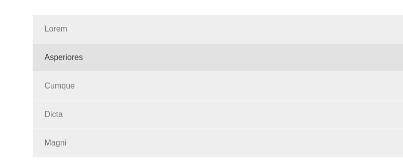
Our menu-items now look stacked one below the other. I captured a screenshot for you to see how it looks like when not styled for bigger viewport sizes.
Responsiveness
This step is crucial to make our navigation menu responsive to the screen or viewport size.
I’m assuming that the minimum width of our regular screen is 1024 pixels. We have already set defaults for the small screen sizes with the mobile-first approach. Now is the time to make the menu look horizontal and not stacked-up.
/* Screen breakpoints
 *
 * Some quick settings to make the menu respond appropriately
 * to different screen sizes.
 */
@media only screen and (min-width: 1024px) {
  /* Baseline */
  .navigation {
    .menu {
      display: flex; /* 1 */
      > li {
        border-width: 0 1px 0 0; /* 2 */
        > a {
          padding: 1.25em 1.5em; /* 3 */
        }
      }
    }
  }
}- Making the menu-list a flexible box does the trick for the inline menu-items.
- Border at the bottom doesn’t make sense for this horizontal order of our menu. Setting a border to the right makes it look way better for this view.
- Finally, adding a bigger padding makes it look more bigger and apt for desktop screen.
Theming
Below SCSS code snippet helps you colorize your navigation menu hassle-free. Just feed color values to the variables appropriately, and you are good to go.
/* Easy theming */

$menu-color: rgba(white, .75);
$menu-bg: #222;
$menu-item-hover-color: rgba(white, .9);
$menu-item-hover-bg: black;
$menu-item-border-color: lighten($menu-bg, 3%);

.navigation {
  background-color: $menu-bg;
  color: $menu-color;
  .menu {
    li {
      border-color: $menu-item-border-color;
      &:hover,
      &:focus,
      &:active {
        > a {
          color: $menu-item-hover-color;
          background-color: $menu-item-hover-bg;
        }
      }
    }
  }
}
You can make it better by adding colors based on your preference and requirements. I’ve kept the demo pretty simple so that we could extend it further as well, to do multi-level menus.
And there you have it! Your simple, yet colorful and attractive responsive navigation menu, ordered horizontally, and done purely with CSS! I’ve more thoroughly discussed stuff coming up around the same topic, and some of it is listed hereunder: