CSS-only Animated Rainbow text
Pure CSS Rainbow text with Animation effects
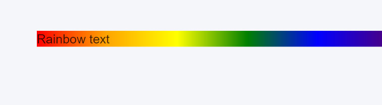
Rainbow text with CSS is pretty easy thing to create while playing with some background properties.
No, you don’t have to separately style the characters of your text. All you need here is the rainbow colors, and a couple of CSS background properties.
In case you don’t know, a rainbow has 7 different colors naming:
- Violet
- Indigo
- Blue
- Green
- Yellow
- Orange
- Red
You can remember all these colors as VIBGYOR, in which each character stands for a color name.
Well, I’m not going to drag you into the whole story of what a rainbow is, but if you want to know more about it, read this wiki.
Coming back to the topic, see the demo of what we are going to create. Now we know the colors we’ve to play with, lets start coding.
The Markup
Firstly, say we have our text in an <h1> tag, just like below:
<h1 class="rainbow-text">Rainbow</h1>I gave it a CSS class called .rainbow-text which we will be fiddling with later on.
As I told above, I’m not gonna separate or target any individual character in our text. Why? Because I need to spread the rainbow all across my text and not just one character.
Next up, we’ll be making use of plain CSS to get things done.
The CSS
Secondly, following the VIBGYOR, let’s add a gradient background to our text which is possible with linear-gradient function.
.rainbow-text {
  background-image: linear-gradient(to left, violet, indigo, blue, green, yellow, orange, red);
}
Above, we have spread out gradient from left to right with all those colors of the rainbow. You may change the marked area to other directions like top, right, an angle in degrees etc. whatever suits the best to your requirement.
We aren’t done yet, as this is just the rainbow background, and not the rainbow text. Clueless? Maybe not.
Here comes the rarely used background-clip property, that turn things around for us. See below its implementation with the previously added gradient background.
.rainbow-text {
  background-image: linear-gradient(to left, violet, indigo, blue, green, yellow, orange, red);
  -webkit-background-clip: text;
}
And voila! It clipped our gradient background to the text which does look some gradient-like thing, but not exactly the rainbow.

One more magic trick we need here to finish the rainbow effect. Any guesses?
It’s nothing but making the text color transparent, which can simple be done as show below:
.rainbow-text {
  background-image: linear-gradient(to left, violet, indigo, blue, green, yellow, orange, red);   -webkit-background-clip: text;
  color: transparent;
}
Alternatively, for webkit, another way to make the text transparent for this effect could be the -webkit-text-fill-color property.
.rainbow-text {
  background-image: linear-gradient(to left, violet, indigo, blue, green, yellow, orange, red);
  -webkit-background-clip: text;
  -webkit-text-fill-color: transparent;
}
See the final demo Animated rainbow text demo
Animated Rainbow text
Below are some quick notes if you want to animated a bit the so obtained rainbow text effect.
- Use repeating-linear-gradient function instead of
linear-gradient. In order to remove the seam from the end, repeat the color at the beginning one more time at the end as well. - Move the background-position at different keyframes. You’ll need to set a huge background-size for the text element so that you could animate the position of the background well enough.
- Loop the animation infinitely for a general animated text use case. Keep the transition function ease-friendly.
- I created this quick demonstration for you to get an overview of animated rainbow text.
And that was it my friend.
In conclusion, the final demonstration consists a variety of examples to show how well the CSS rainbow text renders with different elements. The animated text may not suit well if the readability is the priority.