Touch-friendly Animated Hamburger Icons
In a previous article, I posted my interpretation of an animated navigation menu icon aka the Hamburger icon. It received a fair amount of appreciation from the web people. I thank you all for that.
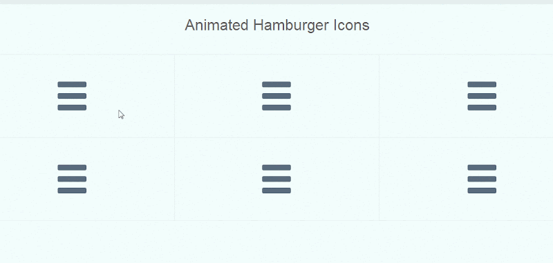
I decided to do more with that and created a set of different animations for it. In this article, you’ll see the improved version of the previously done CSS-only hamburger icon with a set of 6 different animations.
I have used a small bit of JavaScript to toggle the icon animation on click event. Check out the the demo before proceeding further.
The Changes
The code I wrote previously for the icon was not so clean. The changes basically reflect the clean and organized code.
Instead of a div or something else, I’m using a <button> element to wrap the icon. That makes it semantically stronger that the previous one.
let’s call the icon wrapper .hamburger. Inside .hamburger, I have another element (a <span>) which I’ve called .icon.
Elaboration
Our .icon element is supported by the icon wrapper to bring about the complete icon.
As for all of our animations to be smoother, the middle bar needs to be flexible enough, therefore the .icon will solely act as the middle bar for the hamburger icon.
Our icon wrapper i.e. .hamburger is not only acts as a wrapper, but it also participates with the .icon to complete the picture. The other two bars will be added by making use of pseudo classes on the .hamburger element.
HTML
<button class="hamburger hamburger-cancel">
  <span class="icon"></span>
</button>
As you can see above, the button element carries our icon wrapper class i.e. .hamburger. Another class (.hamburger-cancel) is a modifier that plays important role in the icon animation. We’ll have six different modifier classes like this for each animation.
JavaScript
As I have already told you in the beginning, I’m using a small piece of JS to toggle the animation whenever the icon is clicked. Below is the code snippet I’m using here:
var el = document.querySelectorAll('.hamburger');
for(i=0; i<=el.length; i++) {
  el[i].addEventListener('click', function() {
    this.classList.toggle('active');
  }, false);
}
The above JavaScript also toggles .active class on icon click that will help to decorate it's active states.
The Code
The below CSS code sets the defaults for our .hamburger element (which we know is a button). You may adjust the font-size as per your need. Note that bigger the font-size, more obvious will be our icon.
Besides the structural rules, I'll be using CSS transition property in order to make the animations smooth.
.hamburger {
  font-size: 60px;

  display: inline-block;

  width: 1em;
  height: 1em;
  padding: 0;

  cursor: pointer;
  transition: transform .2s ease-in-out;
  vertical-align: middle;

  border: 0 none;
  background: transparent;
}

/**
 * Button height fix for Firefox
 */
.hamburger::-moz-focus-inner {
  padding: 0;
  border: 0 none;
}

/**
 * Focus fix for Chrome
 */
.hamburger:focus {
  outline: 0;
}
Now, it's time to draw the bars for our hamburger icon. Below are the definitions to be more clearer about the bars in our icon:
- First bar:
.hamburger:before - Second bar:
.icon - Third bar:
.hamburger:after
It is obvious that all of the three bars of our icon share some common properties:
.hamburger:before,
.hamburger:after {
  content: "";
}

.hamburger:before,
.hamburger .icon,
.hamburger:after {
  display: block;

  width: 100%;
  height: .2em;
  margin: 0 0 .2em;

  transition: transform .2s ease-in-out;

  border-radius: .05em;
  background: #596c7d;
}

/**
 * Styles for the active `.hamburger` icon
 */
.hamburger.active:before,
.hamburger.active .icon,
.hamburger.active:after {
  background: #2c3e50;
}
Above, we made all of our three bars to fit inside the icon wrapper, and gave them a height with small space in between as we see in the hamburger icon.
To make the bars bit round on edges, we used the border-radius propertly. As our bars are the elements and not text, we made them colorful with the help of background property.
Fair enough, we just have drawn a hamburger icon. Lets move to the next section which is meant for animating the icon.
The Animations
There are 6 different animations for the icon which are explained below one-by-one:
Vertical Hamburger
Starting off with the simplest one, for the hamburger to vertical hamburger transformation, we just need to rotate the active state of the .hamburger element to 90 degrees (or to 270 degrees for a more better animation).
/**
 * VERTICAL HAMBURGER
 */
.hamburger.hamburger-vertical.active {
  transform: rotate(270deg);
}
Close/Cancel/Cross
This one is the most commonly seen animation of the Hamburger icon on web, when it transforms into a "Cancel" icon. The idea resembles my previous interpretation when the middle bar disappears and the other two bars transform to create an "X" or close or cancel symbol.
Note that the animation can't be possible with the rotation only, you need to fill the gaps caused by the rotation by moving the icon accordingly on the Y-axis.
/**
 * CLOSE/CANCEL/CROSS
 */
.hamburger.hamburger-cancel.active .icon {
  transform: scale(0);
}

.hamburger.hamburger-cancel.active:before {
  transform: translateY(.4em) rotate(135deg);
}

.hamburger.hamburger-cancel.active:after {
  transform: translateY(-.4em) rotate(-135deg);
}
Plus
Here, when the animation plays:
- The middle bar gets disappeared
- The top one moves and rotates to act as the vertical bar in the transformation
- And the bottom bar moves and rotates even more to play as the horizontal bar
All of the above 3 actions complete the hamburger-to-plus icon transformation altogether.
/**
 * PLUS
 */
.hamburger.hamburger-plus.active .icon {
  transform: scale(0);
}

.hamburger.hamburger-plus.active:before {
  transform: translateY(.4em) rotate(90deg);
}

.hamburger.hamburger-plus.active:after {
  transform: translateY(-.4em) rotate(180deg);
}
Minus/Dash
For the minus or dash transformation, the middle bar gets dissolved again, and the other two move a bit down and up the Y-axis respectively to look like the one bar. And then the whole icon wrapper element rotates to 180 degrees for better animation.
/**
 * MINUS/DASH
 */
.hamburger.hamburger-minus.active {
  transform: rotate(180deg);
}

.hamburger.hamburger-minus.active .icon {
  transform: scale(0);
}

.hamburger.hamburger-minus.active:before {
  transform: translateY(.4em);
}

.hamburger.hamburger-minus.active:after {
  transform: translateY(-.4em);
}
Left Arrow
This one includes the movements, rotation, and adjustments to the left side in the top and bottom bars while the middle one keeps as it is (except for minor changes to the border-radius). And then a rotation of 180 degrees to make the animation better.
/**
 * LEFT ARROW
 */
.hamburger.hamburger-arrow-left.active {
  transform: rotate(180deg);
}

.hamburger.hamburger-arrow-left.active:before {
  width: .6em;
  transform: translateX(.4em) translateY(.2em) rotate(45deg);
}

.hamburger.hamburger-arrow-left.active .icon {
  border-radius: .1em .25em .25em .1em;
}

.hamburger.hamburger-arrow-left.active:after {
  width: .6em;
  transform: translateX(.4em) translateY(-.2em) rotate(-45deg);
}
Right Arrow
This one is just a mirror image of the left arrow transformation. All the adjustments that were done to the left in the left arrow are done on the right side here with suitable changes.
/**
 * RIGHT ARROW
 */
.hamburger.hamburger-arrow-right.active {
  transform: rotate(180deg);
}

.hamburger.hamburger-arrow-right.active:before {
  width: .6em;
  transform: translateX(0) translateY(.2em) rotate(-45deg);
}

.hamburger.hamburger-arrow-right.active .icon {
  border-radius: .25em .1em .1em .25em;
}

.hamburger.hamburger-arrow-right.active:after {
  width: .6em;
  transform: translateX(0) translateY(-.2em) rotate(45deg);
}Conclusion
I was looking up the web to find something similar to this when I found Sara's Navicon transformicons which are really cool, robust and worth mentioning.
I hope you enjoyed the article, do share your thoughts and suggestions in the comments. Thanks for your time.