Animated Hamburger Menu icon with Pure CSS
Designers nowadays experiment a lot with animations to give their designs cool effects.
In Web design, animating things on certain events creates a much better user interaction if done correctly. But you should always avoid overuse of animations in your projects, as overuse of everything kills the UX.
After getting inspired by this fascinating dribbble shot (it’s an animated hamburger menu icon), I decided to give it a go with CSS. Not purely this, but something close and similar.
The general idea
I’ll create the icon with the help of CSS and arrange it in such a way that its transforming elements look good and similar to our inspiration.
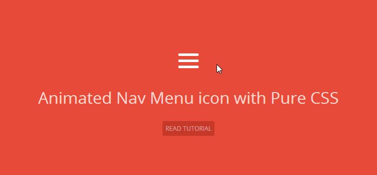
Have a look at how the final product looks like:
The Hamburger Menu icon
Lets kick it off with the crafting of the menu icon.
As most of us already know, a navigation menu icon has three horizontal bars following each other with a little vertical margin.
Doing it with plain HTML and CSS is pretty simple – sparkle some CSS magin in 3 divs and you’re ready to go.
But I’ve done it a different way. Take a look at the markup for our icon:
HTML
<div class="nav-icon">
  <div></div>
</div>
CSS
With CSS :before and :after pseudo elements, our nav icon gets ready without much markup.
.nav-icon {
  margin: 1em;
  width: 40px;
}

.nav-icon:after,
.nav-icon:before,
.nav-icon div {
  background-color: #fff;
  border-radius: 3px;
  content: '';
  display: block;
  height: 5px;
  margin: 7px 0;
  transition: all .2s ease-in-out;
}
I’ve set a fixed width for the wrapping div (.nav-icon), and then used pseudo elements to evolve bars for the icon.
The :before and :after of .nav-icon act as the 1st and the 3rd bar respectively, and the child div acts as the mid bar.
I’ve given all these elements ease-in-out transition so that all the translations and transformations go smooth.
The Animation part
Let me remind you that the animation will play only when the icon is hovered.
The dribbble shot I showed you in the beginning features a slick animation in which the menu icon transforms into a cross icon. To do something similar with CSS, I chose transition and transform properties.
.nav-icon:hover:before {
  transform: translateY(12px) rotate(135deg);
}

.nav-icon:hover:after {
  transform: translateY(-12px) rotate(-135deg);
}

.nav-icon:hover div {
  transform: scale(0);
}
Now, what happens when our hamburger icon gets hovered:
- The first (
.nav-icon:before) and the third (.nav-icon:after) adjust (translate) a bit vertically and then rotate in appropriate degrees to create an X or a cross. In the cross icons, the bars are rotated by 45deg, but I do it 135deg (45 + 45 + 45) to give it a spin animation on transformation. - The middle bar (the child div) scale transforms to 0 on the hover state.
I think that covered it well. I know that people are doing much bigger things than this, but still this was my part. Hope you enjoyed it, I welcome your thoughts and suggestions regarding the same. Thanks for the read.