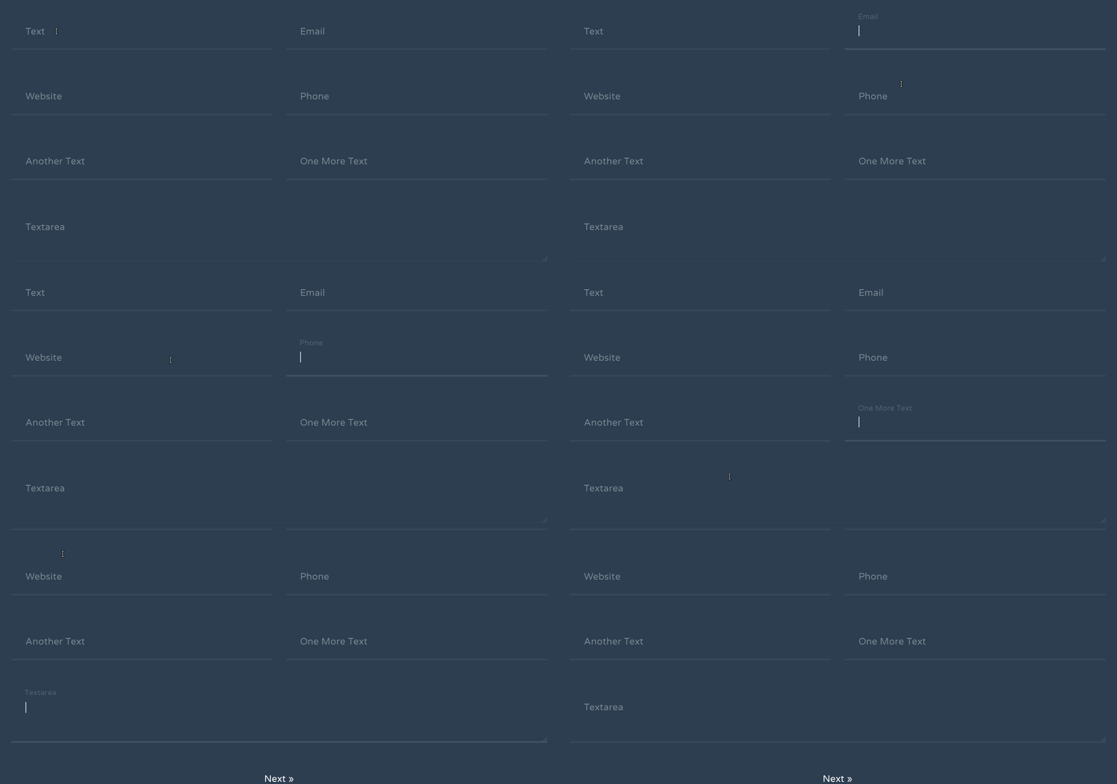
Move that input label or placeholder to the top on focus or while typing.
Quick and Beautiful CSS Floating Labels for Input Fields
Have you seen those input elements with floating labels in the Material design UIs? I saw them first on a dribbble shot, which is pretty slick and interactive.
In case you are unaware of such label animation yet, take a look at the screen capture below.

It is nothing but the movement in the label defined for that specific input box. This animation triggers only when the user focuses or types in.
At first, it gives an effect like the placeholder moves to the top on focus and while typing in something. But you can’t move or animate placeholder actually.
The Concept of CSS Floating Labels
The trickery of floating placeholder effect lies in the following two things:
- Having a separate element with the same content as the placeholder
- Making it work like a placeholder and then animate it further
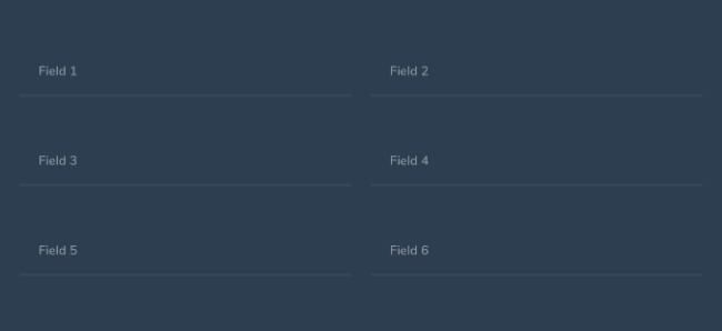
We are going to do everything with the help of CSS and HTML only. Before that here is the sneak-peek of what we are going to create.
With having only CSS in mind for such an effect, you can imagine an input box coupled with a label element. This label can act as a fancy placeholder for our input box and moves above the input field on focus.
With an input box followed by a label, we can style things up easily with the adjacent element selector in CSS (+). We are going to style it in such a way that it gives the effect of a placeholder moving upwards.
HTML
If you are thinking of the required attribute for the input elements, than stop here. We are going to do this without using the required attribute for input fields.
Following is the markup format I found good enough to keep things simple and extendable.
<div class="floating-label-wrap">
  <input type="text" class="floating-label-field floating-label-field--s3" id="field-1" placeholder="Field 1">
  <label for="field-1" class="floating-label">Field 1</label>
</div><!-- .floating-label-wrap -->
In the above code, floating-label-wrap acts as the container for each one of our input box with its label. We have given separate classes to the input and the label to avoid the CSS specificity problems.
CSS
Next up, I want my input box to get rid of those browsers’ default outlines and shadows when it gets focused. Also, an transparent placeholder would be good as we don’t want to show it in this case.
/* Hide the browser-specific focus styles */
.floating-label-field {
  border-width: 0;
  color: rgba(#2c3e50, .75);
  &:focus {
    outline: 0;
    box-shadow: 0;
  }

  &::placeholder {
    color: transparent;
  }
}
At this point, I want to make sure my input box and label look identical on every modern-day browser. I’m going to fix the height of both for that matter, and also provide some padding to make them look proportional.
As you can see, I’ve used CSS adjacent element selector (+) to select the relevant label.
.floating-label-field {
  &,
  & + .floating-label {
    line-height: 1;
    font: inherit;
    padding: 1.5em;
    height: 4em;
  }
}
Why 4em? As you have seen above, I set the line-height to 1 (or 100%) for both of these elements. As a result, it’s going to take its font-size as height; excluding the vertical padding if there exists any.
Thus; the net height (H) for both the boxes with font-size f, line-height l, and vertical padding p can be given by:
H = {(f*l) + (p*2)}
Which gives the net height of our label (as well as input) as 4em.
The default state of our effect requires the label to stack behind the input box. Since a placeholder can’t be drag-selected by the user, we are going to apply the same to the label as done below:
.floating-label-field {
  & + .floating-label {
    position: absolute;
    top: 0;
    left: 0;
    user-select: none;
  }
}
Our label has overlapped the input, but it’s still appears before the it. It’s because the label appears later in the source order. For hiding it completely, we need to stack it behind the input.
Why? Because you wouldn’t like the user clicking the label instead of being able to use the input box. And therefore, the input should be in front of the label for proper execution of the effect.
.floating-label-field {
  &,
  & + .floating-label {
    position: relative;
  }
}
Decorating the Input
Now comes the part when our input box needs some more styling. I’m trying to keep it simple yet stylish and interactive for the user. You may add your own styles later to make it your very own.
I wrote below CSS for a dark body-background, so watch out if you are using a lighter one:
.floating-label-field {
  border-bottom: 3px solid rgba(white, .05);
  background-color: transparent;
  color: rgba(white, .75);
}
Animation and Transformation
Let’s prepare some transitioning and origin settings beforehand for transformations of our pseudo-placeholder:
.floating-label-field {
 & + .floating-label {
   transition: transform .25s, opacity .25s ease-in-out;
   transform-origin: 0 0;
   opacity: .5;
 }
}
And here comes the most important part of our effect, i.e. the transformations. As I said, we are not using the required attribute for inputs here. CSS’s placeholder-shown is good enough to do the task for us.
.floating-label-field {
  &:focus,
  &:not(:placeholder-shown) {
    border-color: rgba(white, .1);
    & + .floating-label {
      transform: translate(1%, -30%) scale(.8);
      opacity: .25;
    }
  }
}
As soon as the input box gets focused, we do the following tasks with the above given CSS:
- Darken the border-color to highlight the selection
- Transform the pseudo-placeholder i.e the label upwards and adjust it accordingly
We want to keep this transformed state as is when there is something in the input box. And this is where the placeholder-shown selector comes in handy.
Finally, let’s add some finishing touch to the input element. Below CSS makes the input box change border colors on valid and invalid inputs.
.floating-label-input {
  &:valid {
    &:not(:placeholder-shown) {
      border-color: rgba(#2ed573, .3);
    }
  }

  &:invalid {
    border-color: rgba(#ff4757, .3);
  }
}
Take a note that the above CSS validates input based on its type. You still don’t need a required attribute for your input fields.
I’ve created some more demos in different styles, you can check them here and here.
Wrapping up, I invite you to share your thoughts on this in the comment section below. Do share it ahead if you liked the effects.