Creating a search box like CSS-tricks.com
I’m a big fan of CSS-tricks. Its a Web design community website which has taught me several important CSS concepts and trickery from basic to advanced level. Whenever I have to dig into a CSS problem, this site is one of my first places to start the research.
Back in 2012, when I started learning CSS with CSS-tricks (and The CSS Anthology), I used to experiment all my learning into creating things like those appear on the website at that time – like those cool hover effects in the pre-footer of the V9 design.
Today, I’ve successfully created something that looks almost similar to a CSS-tricks site asset. Its the search box.
Disclaimer: This demonstration and the article is completely inspired by the design of the popular CSS community CSS-tricks.com. All the credits of its creation goes to Chris Coyier, the man behind CSS-tricks.
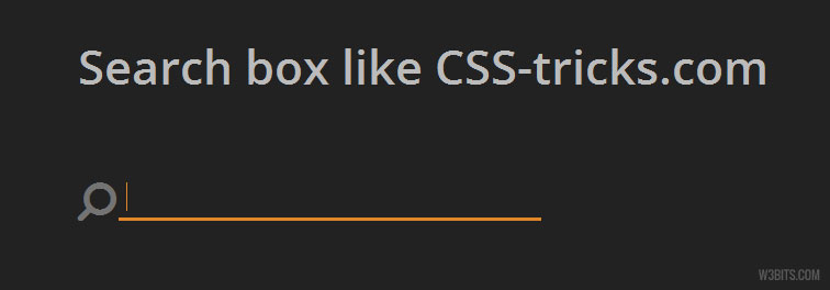
In the current design of CSS-tricks, you can see an awesome minimal search box that is located just below the site logo.

Like most of you, I also found it cool and have tried my hands on to code something similar like that. Before going further, I want to show you a demo:
HTML
Its like a normal HTML form. A .searchform wrapping an search input and input label inside it. I’ve used the micro-clearfix with the .searchform to clear floats of the children (we’ll use CSS floats in the styling part on the children).
In the CSS-tricks search box, the label is the search (or magnifying glass) icon. I’ve used Font Awesome to show a similar icon in the label. The <span class="fa fa.. thing in the input label corresponds to the Font Awesome’s horizontally flipped search icon (with 2x font-size).
<form class="clearfix searchform">
  <label for="search-box">
    <span class="fa fa-search fa-flip-horizontal fa-2x"></span>
  </label>
  <input type="search" id="search-box" placeholder="" />
</form>
CSS
Observe the below CSS code:
.searchform {
  display: block;
  margin: 0;
}

.searchform label,
.searchform input {
  color: #737373;
  float: left;
  vertical-align: baseline;
}

.searchform label { margin: .125em .125em 0 0; }

.searchform input[type=search] {
  font: 1em/1.618 Open Sans, Arial, Sans-serif;
  border: .125em solid #737373;
  border-width: 0 0 3px;
  background-color: transparent;
  padding: .1875em .375em;
  width: 80%;
}

.searchform input[type=search]:focus {
  border-color: #E18728;
  color: #E18728;
  outline: 0;
}

@media only screen and (min-width: 48em) {
  .searchform input[type=search]{ width: 50%; }
}
The Idea
Its completely Chris’s idea. All of the adjustments that have been done to get a similar search box are explained below. Color and padding values are taken from CSS-tricks website.
- The body has a dark background-color (
#222). - Floating the search input and its label to the left will keep them stick to one another. I’ve placed the label above the input, so the label will appear the first.
- I’ve given the label and the input same color (
#737373) in text. The search input has a transparent background and a bottom-only border of2px(=0.125em) with the same color as in text. - A margin of
2px(=.125em) is given to the label on the right and the bottom to make it appear little away from the search input. - A horizontal padding of
3px(=0.1875em) and vertical padding or6px(=0.375em) is given to the search input. - Search input is
80%wide on screen with less width than768px(=48em) and50%wide above or equal to it. - Input on focus changes it’s text and border color to
#E18728. I’ve setoutline: 0;on input focus to avoid blue outlines in Google Chrome.
What’s different?
- Chris has used Noto Sans Google font in the original version. I’ve used Open Sans.
- Original version makes use of SVG for graphics, whereas this one uses Font Awesome icons.
And that’s it. Hope you guys liked it. Thanks for the read.