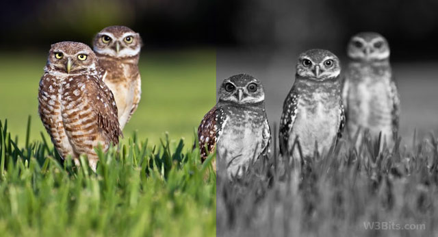
Convert colored images to Grayscale with CSS
Ever tried turning an image into grayscale in CSS? Can it be doable? Yes. With the help of filters.
CSS3 Filters allow you to desaturate an image in the browser. Before these magical filters, there were three popular ways to convert images into Black & White:
- JavaScript Image processing libraries like Pixastic
- PHP GD library filters, on the web (server-side)
- Image editing program like PhotoShop, off the web

Note that the second and the third ways involves the actual conversion of the images. Its okay with the image editing software on your computer, but can be pretty expensive on the server-side.
But why actually convert images to grayscale for web use? Better use JavaScript to visually-process images in the browser? Better use CSS filters.
Using CSS3 filters to make images grayscale is very easy and also avoids using any script libraries. Rest of this article shows how you can do it in merely 5 lines of code.
CSS3 Grayscale filter
We are going to make use of CSS3 grayscale filter on our image to turn it B&W. The grayscale filter is supported in most of the modern browsers, specifically in Chrome 18+, Safari 6+, Opera 17+ with different vendor prefixes. Take a look at the following code snippet:
img.grayscale {
-o-filter: grayscale(100%);
-moz-filter: grayscale(100%);
-webkit-filter: grayscale(100%);
filter: grayscale(100%);
}
With the above CSS, all the images with the class grayscale will appear desaturated or black & white in the browser window.
<img src="mycolorfulimage.jpg" class="grayscale" />Check out the demo.
You may vary the percentage value of the grayscale filter to adjust its intensity as per your need.
What about IE and oldies? (Fallbacks)
CSS3 filters won’t work in older browsers, but if you still want fallbacks for them, below is a list.
Polyfill for Firefox 4+
Using SVG as filter will do the same task for older Firefox versions. Below is snippet:
.grayscale {
    filter: url("data:image/svg+xml;utf8,<svg xmlns='http://www.w3.org/2000/svg'><filter id='grayscale'><feColorMatrix type='matrix' values='0.3333 0.3333 0.3333 0 0 0.3333 0.3333 0.3333 0 0 0.3333 0.3333 0.3333 0 0 0 0 0 1 0'/></filter></svg>#grayscale");
}
For a neater code, you may consider putting the SVG code in a separate file (.svg) and then call it in using filter property.
For older Webkit browsers
In the below code, 1 stands for 100%. A lesser value will lower down the intensity of the grayscale.
.grayscale {
    -webkit-filter: grayscale(1);
}
For IE 6-9
No control over intensity though:
.grayscale {
    filter: gray;
}
For IE10+
No CSS fallbacks available for IE10+ yet, therefore you have to use a different solution like grayscale.js or similar.
The final CSS
.grayscale {
  -webkit-filter: grayscale(1); /* Older Webkit */
  -webkit-filter: grayscale(100%);
  -moz-filter: grayscale(100%);
  -ms-filter: grayscale(100%);
  -o-filter: grayscale(100%);
  filter: grayscale(100%);
  filter: url("data:image/svg+xml;utf8,<svg xmlns='http://www.w3.org/2000/svg'><filter id='grayscale'><feColorMatrix type='matrix' values='0.3333 0.3333 0.3333 0 0 0.3333 0.3333 0.3333 0 0 0.3333 0.3333 0.3333 0 0 0 0 0 1 0'/></filter></svg>#grayscale"); /* Firefox 4+ */
  filter: gray; /* IE 6-9 */
}
The above code has power good enough to make your images appear grayscale in major browsers except IE10+. Watch the demo again, or let me know your thoughts on this.