CSS Image hover zoom effects
Image hover Zoom n’ Rotate effect with Pure CSS
Modern day web is full of animations. A simple animation for example, could be zooming-in images on hover event — within a specific viewport container. Here, viewport is not the screen, but a smaller container wrapping our image.
I have worked on more than a few web layouts which demanded the blog post thumbnails to zoom-in when hovered but within a container element.
You might have also seen this effect on many modern blog designs. See the demo first to get a better overview. You may also fork this repository to get access to all the code covered in this tutorial.
Now, you might think of getting this done with jQuery firsthand, but wait! Why would you go for JavaScript when you have CSS there to do that for you?
If you were thinking of JS to bring about this simple effects, you need to know that you can do it with pure CSS too without any JavaScript involvement–because CSS3 is powerful enough to animate things in the browser.
Quick CSS snacks for Image hover-zoom effects
Doing a hover zoom in CSS is quite a simple thing. All you need to know is couple of CSS3 properties and you are good to go, leave the trickery part on me, because it’s a bit more than just knowing CSS properties.
The Trickery
It’s already known to those who are good at CSS, and now it’s your turn. Let’s get into this concept now.
We need a container element which will be hovered and then the image inside it should animate accordingly, i.e. zoom-in or zoom-out as per the need.
Note that the image should zoom on hover inside the container element and do not come or flow outside of it when it gets zoomed.
So, the basic idea is to limit the container element with the CSS overflow property.
The zooming and animation parts will be handled with the CSS3 transform and transition properties respectively. Sounds pretty easy, doesn’t it?
The Markup
The HTML is very simple. We have .img-container as the container wrapping our img.
<div class="img-hover-zoom">
  <img src="/path/to/image/" alt="This zooms-in really well and smooth">
</div>
You may iterate this piece of code as many times as you want in your project.
The CSS
Observe the below CSS.
/* [1] The container */
.img-hover-zoom {
  height: 300px; /* [1.1] Set it as per your need */
  overflow: hidden; /* [1.2] Hide the overflowing of child elements */
}

/* [2] Transition property for smooth transformation of images */
.img-hover-zoom img {
  transition: transform .5s ease;
}

/* [3] Finally, transforming the image when container gets hovered */
.img-hover-zoom:hover img {
  transform: scale(1.5);
}
Translation
- Setting the
overflowproperty hidden for the container avoids the image flowing outside on transformation. You may also set some height for the container, like I have done, which perfectly suits my need at the moment. More on CSS overflow property - Adding
transitionproperty adds that smooth effect to the transformation of the image. If you are new to this CSS transitions, you should read more about them here. - Finally, setting a scale transform on image hover event will do the zoom part.
More effects
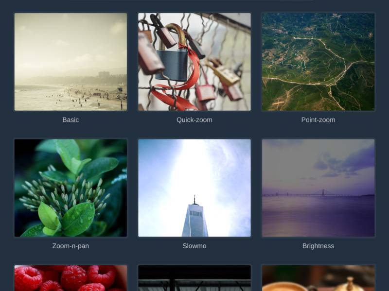
If just the basic is not enough for you, below are some ready-made recipes for you to grab and make use of in your projects.
Each of the below given CSS effects are different, so you’ll also need a common class i.e. our image container to be included with each of them.
/* The Image container */
.img-hover-zoom {
  height: 300px; /* Modify this according to your need */
  overflow: hidden; /* Removing this will break the effects */
}
The basic HTML
<div class="img-hover-zoom img-hover-zoom--xyz">
  <img src="/path/to/image/" alt="Another Image zoom-on-hover effect">
</div>
Don’t forget to replace img-hover-zoom--xyz with the CSS selector with the one listed below. I think you have the basic understanding by now of what you have to add and what not.
Quick zoom-in
/* Quick-zoom Container */
.img-hover-zoom--quick-zoom img {
  transform-origin: 0 0;
  transition: transform .25s, visibility .25s ease-in;
}

/* The Transformation */
.img-hover-zoom--quick-zoom:hover img {
  transform: scale(2);
}
Point-zoom
/* Point-zoom Container */
.img-hover-zoom--point-zoom img {
  transform-origin: 65% 75%;
  transition: transform 1s, filter .5s ease-out;
}

/* The Transformation */
.img-hover-zoom--point-zoom:hover img {
  transform: scale(5);
}
Zoom-n-rotate
/* Zoom-n-rotate Container */
.img-hover-zoom--zoom-n-rotate img {
  transition: transform .5s ease-in-out;
}

/* The Transformation */
.img-hover-zoom--zoom-n-rotate:hover img {
  transform: scale(2) rotate(25deg);
}
Zoom in slow-motion
/* Slow-motion Zoom Container */
.img-hover-zoom--slowmo img {
  transform-origin: 50% 65%;
  transition: transform 5s, filter 3s ease-in-out;
  filter: brightness(150%);
}

/* The Transformation */
.img-hover-zoom--slowmo:hover img {
  filter: brightness(100%);
  transform: scale(3);
}
Brighten and Zoom-in
/* Brightness-zoom Container */
.img-hover-zoom--brightness img {
  transition: transform 2s, filter 1.5s ease-in-out;
  transform-origin: center center;
  filter: brightness(50%);
}

/* The Transformation */
.img-hover-zoom--brightness:hover img {
  filter: brightness(100%);
  transform: scale(1.3);
}
Horizontal Zoom-n-pan
/* Horizontal Zoom-n-pan Container */
.img-hover-zoom--zoom-n-pan-h img {
  transition: transform .5s ease-in-out;
  transform: scale(1.4);
  transform-origin: 100% 0;
}

/* The Transformation */
.img-hover-zoom--zoom-n-pan-h:hover img {
  transform: scale(1.5) translateX(30%);
}
Vertical Zoom-n-pan
/* Vertical Zoom-n-pan Container */
.img-hover-zoom--zoom-n-pan-v img {
  transition: transform .5s ease-in-out;
  transform: scale(1.4);
  transform-origin: 0 0;
}

/* The Transformation */
.img-hover-zoom--zoom-n-pan-v:hover img {
  transform: scale(1.25) translateY(-30%);
}
Blur-out with Zooming-in
/* Blur-zoom Container */
.img-hover-zoom--blur img {
  transition: transform 1s, filter 2s ease-in-out;
  filter: blur(2px);
  transform: scale(1.2);
}

/* The Transformation */
.img-hover-zoom--blur:hover img {
  filter: blur(0);
  transform: scale(1);
}
Colorize with zooming-in
/* Colorize-zoom Container */
.img-hover-zoom--colorize img {
  transition: transform .5s, filter 1.5s ease-in-out;
  filter: grayscale(100%);
}

/* The Transformation */
.img-hover-zoom--colorize:hover img {
  filter: grayscale(0);
  transform: scale(1.1);
}
PS: I’ll be glad if you mention me somewhere in your project for this.
What more?
Further, you may play with the transform and transition properties to bring more attractive effects out of it. I’ll share more of such slick effects in future as well, covering more elements and not just images.
Wrapping up, I hope this came in handy for you some way or another. If it did, let me know in through your comments. Grab all the code covered here in this GitHub repo, and keep supporting for more content like this. Cheers!